Showing posts with label Blue Fern Studios. Show all posts

Friday, 21 October 2016

Seaside Cottage by Blue Fern Studios

I am over on the Scrap,Paper Scissors blog today with my newest layout using Blue Fern Studios
==========================================================================


Hello to you all, it's Anita here with my first offering using some items from the lush Seaside Cottage Collection by Blue Fern Studios. The soft vintage summer colours and sun bleached wood patterns make this such a pretty set....with a little extra distressing I achieved a look that I am happy with.

Our family holiday this year was based in Somerset, one day we drove down to Briport in Dorset and onto West Bay. It was such a pretty little place and we very much enjoyed seeing some of the places that were used in the making of the series Broadchurch. I took this selfie of us when we were out on the harbour wall (after we had all been crabbing) and when I saw this range of papers I just knew they would be a perfect pairing.


The layout is based on a sheet of Gala. I cut a few slices in random places on the wooden slats, rolled back gently and inked to distress the edges and make them stand out. I then cut the large ships wheel from the sheet of Mermaid and popped lots of foam pads underneath, raising it up to give some dimension to the layout.


Over the years unfortunately I seem to have acquired a rather large obsession with using blossoms.....everywhere and anywhere on my layouts, whatever the theme may be (nothing is safe!!) So I rummaged about and picked some that I liked and then layered some of them together. My photo seemed to be a bit stark against the softness of the papers so I softened the edge by gently sponging with light brown, then white acrylic paint and finishing by gently rubbing some gold gilding wax along the edges. I popped a couple of gold doilies under the photo for a partial mat.

I cut out a few elements from the Calling Cards sheet, inked the edges and added them to the page. I also had some wavy shaped die cuts to play with. I painted them white and then dragged wisps of pale turquoise across them and then finished them off with a gentle rub of more gilding wax. I also rubbed some gold wax onto the edges of the ships wheel, each of the blossoms and all around the edges of the layout, giving a soft metallic sheen which gently compliments the gold in the doilies.


Once again Blue Fern Studios have produced another beautiful collection of papers that are lovely to work with and this and several other collections from them are available in the shop...... I hope you liked my layout, I will be back early next month with another project using some more of these gorgeous papers.

TTFN, Anita xx

Sunday, 19 June 2016

...and so the Adventure Begins...'Blush' from Blue Fern Studios

Having had the enjoyment of playing with papers from the 'Serendipity' Range from Blue Fern Studios earlier on in the month, I have also been lucky enough to play with some of the 'Blush' papers too. I thought they were perfect for scrapping one of our wedding photo's, taken back in Sept, 1992.

  I always find it hard to photograph layouts to capture the true colours, sparkles and shimmers on the page and this is very true for this layout, such a shame. It started off as a shabby pink, but actually ended up in varying shimmering shades of copper, rose pink and stone white.


I used a sheet of Blush 'Celebration'
for the base of the layout and then I used a Harelquin mask and some texture paste to create the dimentional background.  I gave it a few squirts with some Rose spray and then a generous squirting of Copper Shimmer mist ( you can NEVER have too much shimmer and shine!!)
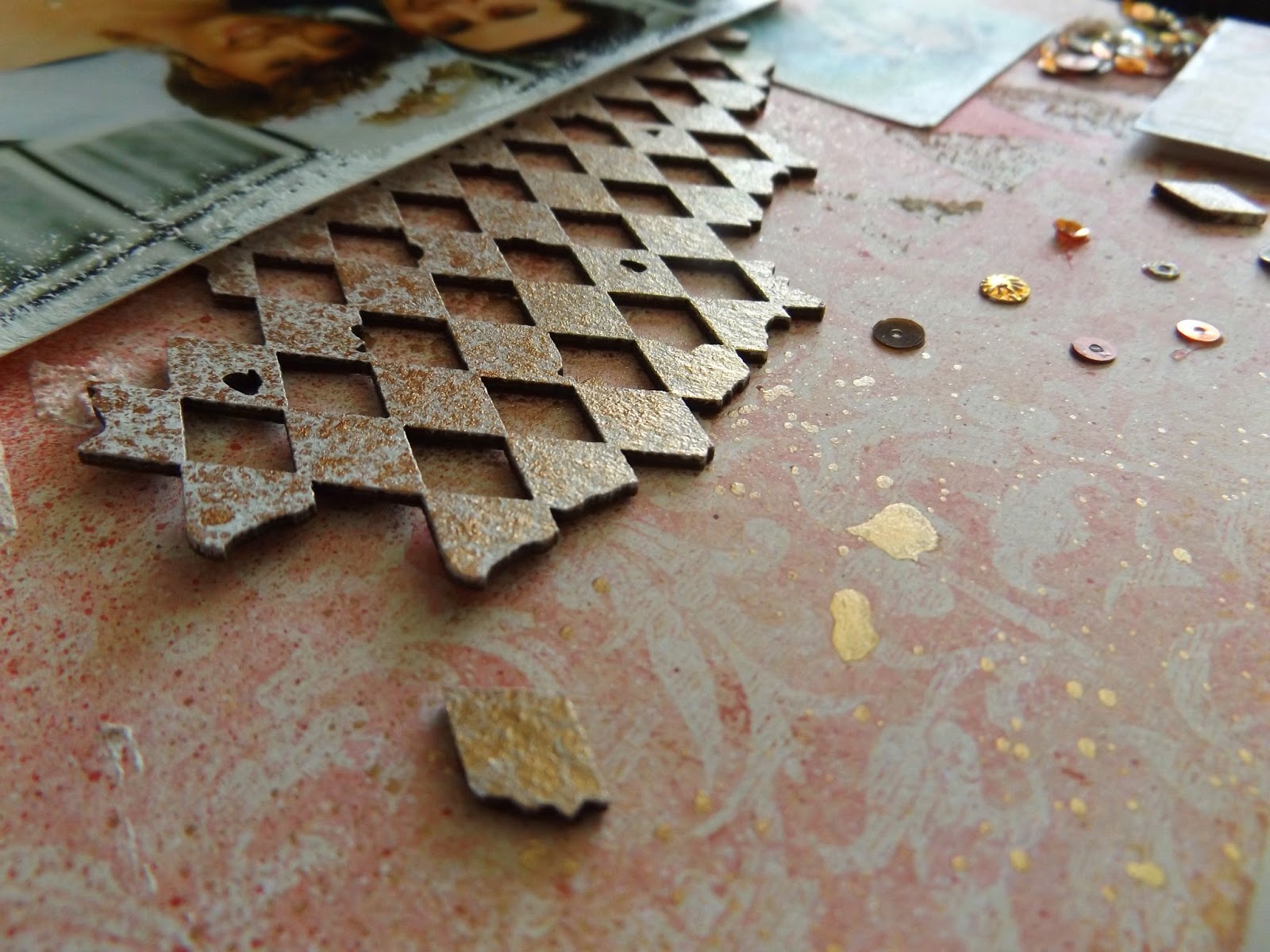
I had some harlequin chipboard to work with and I coated this with white acryic paint and lots of Copper shimmer mist, then scattered the peices about across the layout in various places. I wanted the photo to stand out, but without a mat to sit it on, so i sponged all round the edge with some more white paint just for some gentle definition.

I also had some black lace that I wanted to add, but it was way to harsh in black. So I sponged it with white paint and then added some Stickles.  I laid the lace just under the edge of the photo ( which I had raised up on foam pads for a little more dimension) I also added a couple of Prima Blossoms ( also gently sponged with white paint to tone the colours down a bit) And I made a couple of rolly roses and added a pearl in the centres. ( tutorial for roses here )


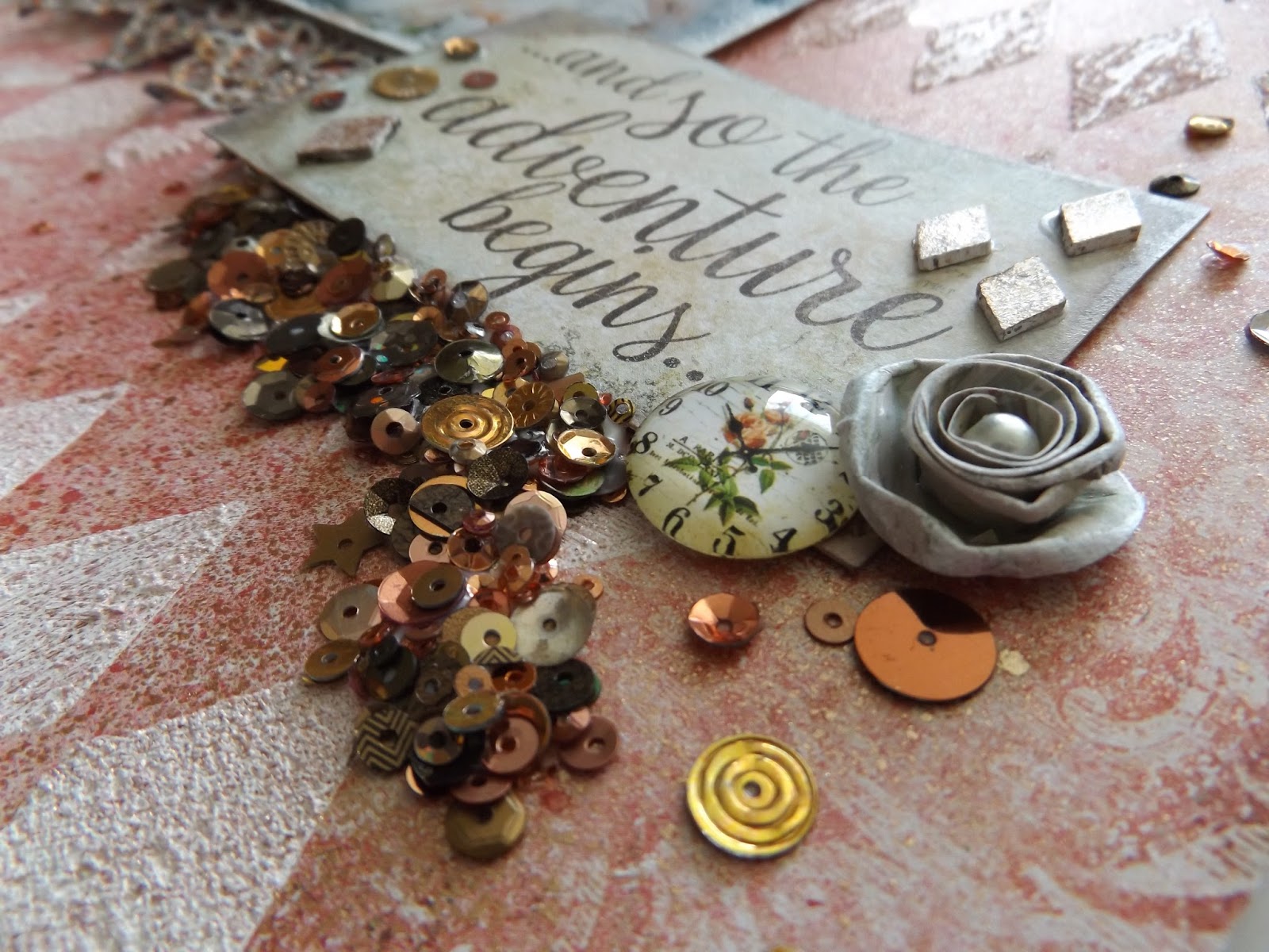
The sheet of Valentine Cards is covered with some lovely bits and peices, but I only cut out a couple of sections and added to the page. The bottom quote was taken from a sheet of Serendipity Calling Cards and I just popped on another rolly rose and a vintage cabouchon.


To finish the layout I just needed a bit more sparkle, but didn't know quite what.
I am really enjoying using sequins on my layouts at the moment. Normally I would just gently sprinkle a few around, but I went a bit wild! I started with just a few little odd sprinkles, but then decided I wanted some large clusters.....so i pooled some glue under the quote and built up a nice thick cluster of sequins in various golds, coppers and bronzes .... and then I thought I should stop!

I really have enjoyed creating with these Blue Fern Studios Papers and if you pop over to the shop you will find there are several designs available.
Thanks for looking, see you again soon.
Anita xx